A Guy Named Dallas Thinks The City Of Dallas Needs A New Flag. Because Dallas.
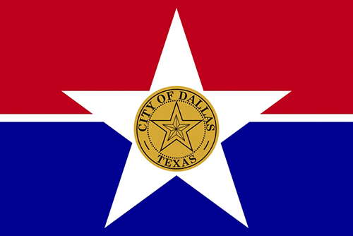
Did you know that Dallas has an official city flag? It's true! And it's ugly as all get-out.
Let's examine:

Adopted in 1967 to replace an only slightly less hideous design, the current Dallas flag is a garbage pile of ideas, and a graphic designer's worst nightmare. For a lack of better ideas, the equally terrible but acceptably boring city seal was haphazardly slapped in the middle of a white star that rests between two generic blue and red rectangles. The effect, as the Dallas Morning News has already so astutely pointed out, is a lame star inside an even lamer star.
This morning, however, an online petition to Mayor Mike Rawlings went live, pleading that he scrap this trash banner in favor of a flag for the people, one that would have a “positive and unifying effect on the citizens of Dallas.”
We tend to agree with the guy behind this movement. Not just because he makes so many salient points in his plea, but because his name is Dallas May and, well, c'mon, Dallas needs a flag designed by a guy named Dallas. It's like the most Dallas thing ever.
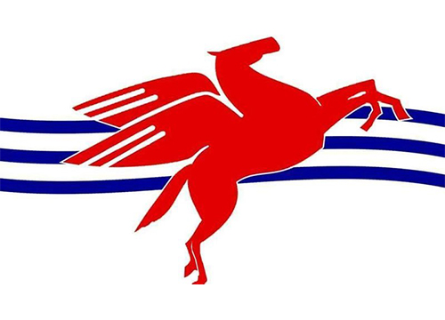
After a recent crowd-sourcing campaign, the design currently at the top of the heap of this movement's potential replacements is a familiar red Pegasus flying over three blue stripes that are said to represent the Trinity River. Hey, some actual symbolism that's so instantly recognizable that it doesn't need the words “City of Dallas” emblazoned across the center like the city's current banner of shame! Alright!

Unlike that other recent suggestion that Dallas needs to rebrand by changing up its ubiquitous Triple D logo, this is a change we reckon will have few naysayers. Or it shouldn't, anyway. Like that logo, which has been recently embraced by the hip-hop and fashion communities, the Pegasus is a symbol that's already been pretty engrained into the framework the city, popping up on signs and logos just about everywhere. This design represents both our origins, as the Trinity was the biggest reason John Neely Bryan decided to settle here in the first place, and the Pegasus, originally the logo for Mobil Oil and a representation of Dallas' industrial spirit, not to mention the biggest driver of the local economy.
Though I could go on endlessly, I get the feeling I don't have to. I mean, who isn't on board with this idea? The city's current flag is nothing short of a rarely-seen abomination. Why not replace that dated piece of crap with something the people of Dallas would be proud to hoist up their flagpoles or slap on T-shirts? Who wouldn't want that?
A boring, tasteless monster probably.


