A First-Hand Review of The New Myspace.
Ever since Justin Timberlake introduced a video sneak-peak of the New Myspace just a couple months ago, nerds everywhere have been waiting to get their hands on the new-look, side-scrolling social network.
Well, for us, that time came on Tuesday night. Somehow, we were lucky enough to get our hands on a first-issue “Pre-Launch” invitation to join the site.
And, of course, we jumped right in.
So. What Do We Think Of It?
First things first: This is in no way a redesign of the Myspace that you knew and once loved before. It's brand new. And it's downright beautiful.
We already know that the company got some star power to sit on the board to help resurrect this thing, but the real stars here are the designers. It's clear that there were no expenses spared in making sure the aesthetics, and experience of the New Myspace turned out top-notch.
Once you look at it, it's hard to look away. Once you play with it, it's hard to stop playing.
That's because, while the New Myspace is indeed a social network like its predecessor, it's also a very capable music service. The experience is very much laser-focused on music — discovery, consumption and sharing. It manages to combine important aspects of Facebook and Spotify and merge them in way we have never seen before.
See, on Facebook, music discovery is a somewhat passive experience. You could say the same for Spotify and its social experience.
The New Myspace, on the other hand, blends both into a nicely balanced and well-attended party in your web browser.
But there's more to this new network than just music and social networking.
Signing Up. Still, once you receive an invite, signing up is a breeze. The whole process takes less than five minutes. You can create an all-new account, or you can even choose to sign in with your Facebook account.
You can't, however, use your old Myspace credentials. Sorry. Those are worthless here.
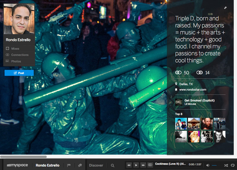
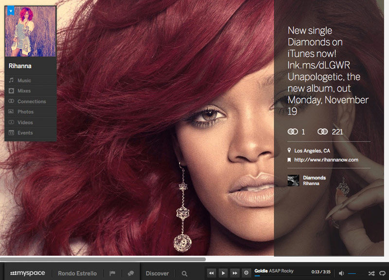
Once signed in, you're prompted to set up your profile, which consists of a profile pic, a short bio (complete with input fields for your location and a URL to promote your web presence), and a cover (read: background) photo. After you're a little more acquainted and after you've score a few connections (read: friends that you follow, but not necessarily people who follow you back), you can come back and add a profile song and arrange your Top 8 — both features that carried over from Myspace 1.0 to the 2.0 version.
Oh, but Tom’s gone. Well, as an automatic friend or member of the board behind the company, at least. Sorry.
The Experience. It's a bit of a resource hog — and not for the weak of WiFi — and, in truth, I found it to hang a bit when browsing through the site at a coffee shop, using a shared Internet connection.
As stated before, the experience is heavily focused on music discovery, consumption and sharing. And there are a lots of ways to do both. (More on that later.)
The social aspect of the experience revolves around your connections. Connections can be people, artists, albums, songs and videos.
The last three don't make as much sense as the first two just yet, though. Once the site gets more populated, the purposes for these connections may become more clear.
Long story short: There are three types of connections to be made. You can subscribe to a connection, be subscribed to by another user or have a mutual two-way connection. Once subscribed to a connection, you'll be privy to all of that connection's updates and activity. This is one of the methods of second-hand discovery — and a big one. When you subscribe to artists, albums, songs and videos, you are essentially adding this content to your music library.
Meanwhile, anyone who has made you a connection of theirs will have the chance to see your every move. It's serendipity at its finest.
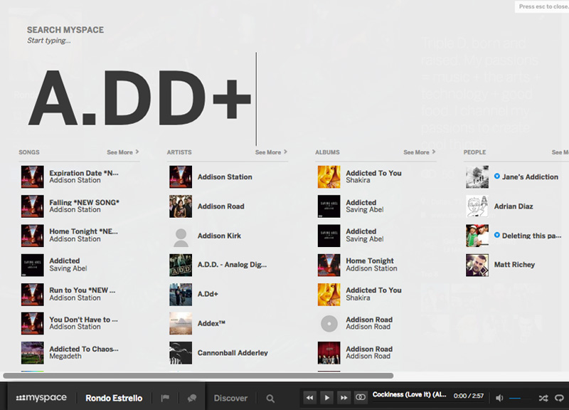
Another way to discover new music or find music you are already hip to is via the “Search” feature. You can search by artist, album, track name or keyword. And, unlike with Spotify, there's no need to worry about exact spelling. If you are off a little, the New Myspace will still serve up what you are looking for.
All of this makes for an easy time collecting content. And, in an age where the idea of access-over-ownership is really starting to catch on, content wears the crown. You’ll quickly learn that the New Myspace doesn't lack in this department. Licensing deals are not public at this time, and it's still not clear how this business model will turn out, but, for the time being, there is a ton of content to sift through. Lesser known and even local artists were easy to find in our searches.
Once collected, you can play your content from anywhere. You see it throughout the site, too. The music will follow you around via the ever-present player docked to the bottom of your screen. But that's not all: You can share the song you are listening to on another user's page, start a radio station based on it or even add it to a mix. So many possibilities.
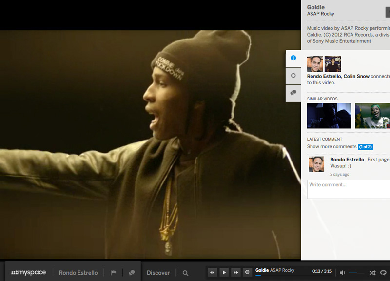
Video playback, meanwhile, is displayed edge-to-edge on your browser with a fly-over, and it looks absolutely stunning.
At the moment, though, the whole thing feels like a new frontier. There aren't many people signed up yet. But there's so much fertile ground for exploration.
The Interface. What else, you ask?
Well, there are two types of navigation: Global Navigation, located statically on the bottom of the page, and Page Navigation, which is located to the top left of your browser.
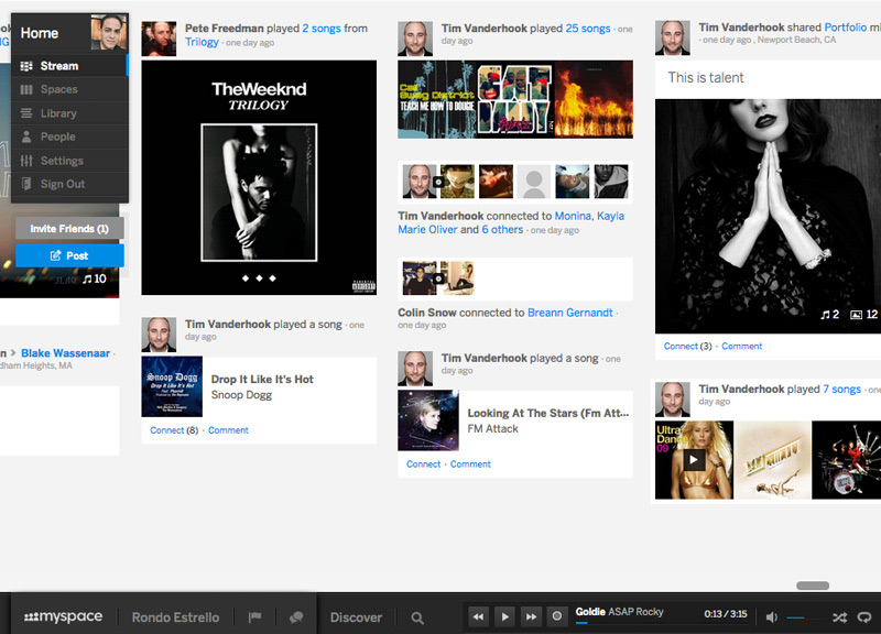
Clicking the “Myspace” logo in the Global Navigation takes you to the Home Page, where you can see a stream of all your connections' latest activity. Again, this is a key area for music discovery. It's also where you can access your Library, Spaces, People and Settings pages.
Clicking “[Your Name]” in the Global Navigation takes you to your Profile Page, where you can manage your content and where your connections can learn more about you, see your latest activity or write you a message. Consider this your “wall,” if you must.
There are also Artist Pages, which look very similar to Profile Pages, where you can explore an artist's music, photos, videos and tour dates. Presently some artists have even been slapped with a “verified” tag. This reassures that users are connecting with genuine product. It feels very official.
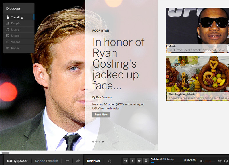
Also located in the Global Navigation is the ever-present music player with standard audio controls. You'll also find a “Discover” link that takes you to the Discover section where you can find trending topics, recommended people and more music to browse through. In all honesty, though, this section seems a tad redundant; there are already plenty of other solid means for discovery built into the system elsewhere.
Lastly, the “Search” button is also buried below in the Global Navigation. It definitely seems like an underplayed location for an excellent feature. Myspace: If you are listening, please move this button to the top. It will make it much more user-friendly, I promise.
Once you do find the “Search” button and use it, though, you'll notice something: It's amazing.
Just start entering text, which is displayed in jumbo-sized characters, and several categorized columns will populate with likely guesses at what you're looking for. This information is sorted by Songs, Artists, Albums, People (usually the verified artist) and Videos. Connect and collect as many as your heart desires.
Other features include a “Notifications” tab as well as an Instant Messaging panel to chat with signed-in friends — all while listening to some tunes of your own without skipping a beat.
All in all, this interface is a breath of fresh air — and very unique in the world of cookie-cutter websites we live in today. I'm confident that it will only improve prior to the official launch, too.
So What Does The Future Hold For The New Myspace? It seems that the end game for Myspace here is not only to set itself up as a competitor to other, popular streaming music services such as Spotify and Pandora, but to kill them dead. The people behind Myspace seem intent on this concept, too, as they're currently in the process of raising a boat-load of cash before a proper launch in 2013.
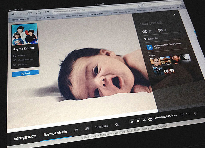
It's also a no-brainer that they will need to pay lots of attention to mobile. Currently, the site does not work on smartphones or tablets. That said, it does look beautiful on an iPad; it just doesn't produce any audio. I imagine the hand-held mobile version as being dumbed down to focus more on playback than discovery, but we'll have to wait and see on that front.
Perhaps, however, Myspace is looking at this from the opposite perspective: The site seems to be a natural fit for display on larger screens or TVs, and could certainly make a splash in the set-top scene.
It should be interesting to see how and when the company rolls out the next few batches of invitations.
For the time being, though, we'll keep exploring, praising and complaining as we wait for more settlers to show up in this brave New Myspace world.
It's a fun one, if nothing else.
As noted, the New Myspace is currently in a very early public beta testing mode. At this point, you'll need an invitation to sign up. (Before you ask: Sorry, we're all out of invites.)
The New Myspace experience is both robust and feature-packed. This may be a gift and a curse, though. You're sure to be overwhelmed at first. Stick with it, though, and you may be happily discovering new features days into exploring.
One of the first things you'll notice upon signing into the New Myspace is the smooth and sexy, side-scrolling action (which, uh, we obviously enjoy here at Central Track). This feature carries through just about every area of the site and does the heavy-lifting for displaying most of the visual content.
With a brand new website comes a brand new set of goals. And it wasn't too hard for us to find an article published just days before the initial set of beta invites were sent out that details just what Myspace has in mind.
