Gorilla Vs. Bear Creative Director David Bartholow Designed The Official Wimbledon 2014 Poster.
For the most part, Chris Cantalini gets a lot of the credit as the Dallas-based online music taste-making giant Gorilla Vs. Bear goes. And duly so: He is, after all, the one who picks all the music that populates his site.
But David Bartholow deserves plenty of shine, too. As GvB's creative director and chief photographer, it's the Dallas-bred, Los Angeles-dwelling Bartholow who has spearheaded many of the site's notable visual efforts — nostalgia-driven posters, muted color schemes, a prioritization of Polaroid imagery that in turn arguably kicked off the entire resurgence of instant film — and crafted an aesthetic of which even The New York Times approves.
Even so, it's his latest accomplishment that just might be his coolest.
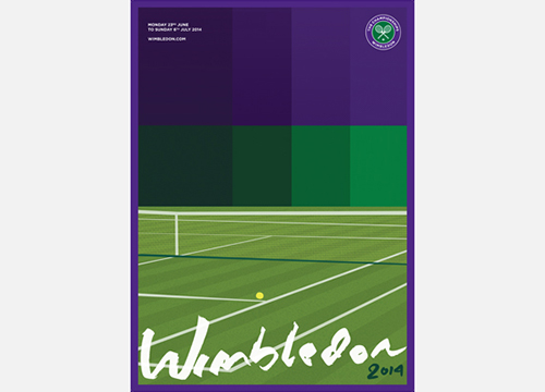
Earlier this year, when professional tennis' annual Wimbledon Championships — the oldest tennis tournament there is — opened its poster design entry pool to include U.S. contestants for the first-ever time, Bartholow entered the below design.
Better yet, he won the damn thing. In April, his was selected as the official Wimbledon 2014 design.
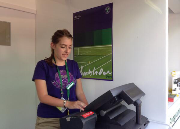
Further proof of this fact: Here's a picture circulating on Twitter of the poster, straight chilling on a wall at the All England Lawn Tennis and Croquet Club now that official tournament play is underway.
The All England Club president said Bartholow's design “well represented Wimbledon.”
But this quote from tennis legend John McEnroe, who had a hand in the selection process, is cooler: “This poster got my vote because it was traditional but also bold and with the times.”
Right on, Mac. We couldn't agree more.


